

UIKit Lab
UIKit Lab is an interactive guide to standard iOS UI components listed in Human Interface Guidelines. With UIKit Lab, instead of looking up official documentation, searching your iPhone or iPad for a "real" example, or asking your developer friend, you can play with standard iOS UI components right from your iPhone/iPad and even customize one to your liking, all in a centralized place.
The problem
As a product designer who frequently works with iOS design system, I often face the situation where I need to select an appropriate UI component for a part of UI, I might have a few candidates in my mind, but sometimes I want to check the exact look and feel of them before making a decision. Unlike developers, I don't always have the access to iOS simulator where I can check out a live demo.
Though there are well-built UIKits offered by the design community, most of them are static Sketch files which means I always need Sketch to view or customize them. Some of them are not even accurate enough. What’s even more concerning is that based on my research, UX/UI community also faced similar situations once a while and it’s becoming more frequent as the iOS UI components become increasingly diverse and complex.
A closer look at pain points
As mentioned above, such an awkward scenario didn't just happen to me, colleagues of mine and people from the designer and even developer community also faced similar problems, as seen from here and there. As a result, the community developed their own UI kits in Sketch or "designer guide" to these iOS UI components like this on Stack Overflow and Medium. However, regardless of the medium they exist, most of them are still static and they can only be viewed or customized in desktop-only design software like Sketch, lacking the ability to interact with designers right from an iPhone or iPad where the end experience will run, not to mention all those animations and transitions that come with a certain component like the transition of triggering a context menu will be unavailable.
To summarize, these are the major pain points designers face when dealing with conventional iOS UI kits:
Most UI kits are static.
Desktop design software is required to use most UI kits.
Not a great option to learn about the animation or transition of some components.
User story
I want to help...
When it comes to the target audience of my "yet-to-become-solution", it becomes fairly clear that UX/UI designers who frequently work with iOS design guidelines or have an interest in learning more about them will be the main target audience.
I want to help my fellow designers
Understand target audience's context
Based on what I learned from my own experience, my colleagues and the community, I tried to picture the context of my target audience when conventional UI kits won't cut it:
Goal: find accurate and interactive examples of a standard iOS UI component on the go
Time: the need for interactive and accurate demos of standard iOS UI components usually happens when the design process reaches high-fidelity prototyping or UI specification.
Location: designers usually work on desktop, but during meetings, discussions, or even coffee breaks, looking up documentation/UI kits becomes less accessible.
Emotion: uncertain, anxious.
User stories
With the context I defined above, I developed some user stories that my solution should be able to help with:
As a designer, they should be able to play with interactive demos of iOS UI components so that they know exactly how it works.
As a designer, they should be able to do what is mentioned above from my iPhone or iPad so that they do not have to use my desktop.
As a designer, they want all demos of iOS UI components to be accurate, native, and reflect their exact look and feel so that they can make sure they will make the right design decision.
Ideation
Based on the context and user stories I defined, I came up with some brilliant ideas. Here are some of them:
An iOS app that has a collection of interactive demos of standard iOS UI components.
A web app that has a collection of interactive demos of standard iOS UI components.
A video chat app where designers can chat with developers who are willing to show designers live demos of iOS UI components.
An online course/Youtube channel where I post a series of videos that teach everything designers need to know about iOS UI components.
and many more weird ones...
Narrowing the scope
I have set the goal of building something real and practical other than spec work at the very beginning. I knew basic HTML & JavaScript but I don't know backend development, so a video chat app that involves complex data transmission becomes unfeasible for me to build. An online course or a Youtube channel can help some designers learn more about iOS UI components, but it is still not interactive, thus failing to solve the problem. A web app can definitely host a collection of interactive demos of standard iOS UI components, and it can be viewed from any device, but the biggest drawback of this one is that using Web as the medium means all demos will not be using native iOS API. This could be a huge problem when it comes to maintenance and the fidelity of web-based demos can't match that of a native iOS UI component.
Therefore, I chose to develop an iOS app using native iOS API. This way, my users (designers) can play with the UI components right from their iPhone or iPad, and I can make sure that the look and feel of my components match the exact look and feel of native ones (because they are)!
Yes, that also means I need to learn Swift from the beginning, but why not?
Design setup
I know. To build an iOS app, first I need to design it. As a designer myself, I usually like to start my interface design by listing the requirements and constraints for my app. Based on the requirements, then I start making the high-level decisions for things like app category, device support, design guidelines to follow, and accessibility, etc.
Requirements and constraints
My app can run on both iOS and iPadOS.
My app allows users to interact with standard iOS UI components just like they would in other native iOS apps.
My app should include demos of most common standard iOS UI components.
My app should support basic iOS accessibility features like Dynamic Type and VoiceOver.
Customization of a UI component should be supported, but users cannot fully customize it like they can in Sketch because all demos will be built with native iOS API and there is a limit of how much a UI component can be customized natively.
With requirements above, I made these high-level decisions for my app's interface design:
App category
Designer tool, reference app
Device support
iPhone and iPad
Typography
System font
Iconography
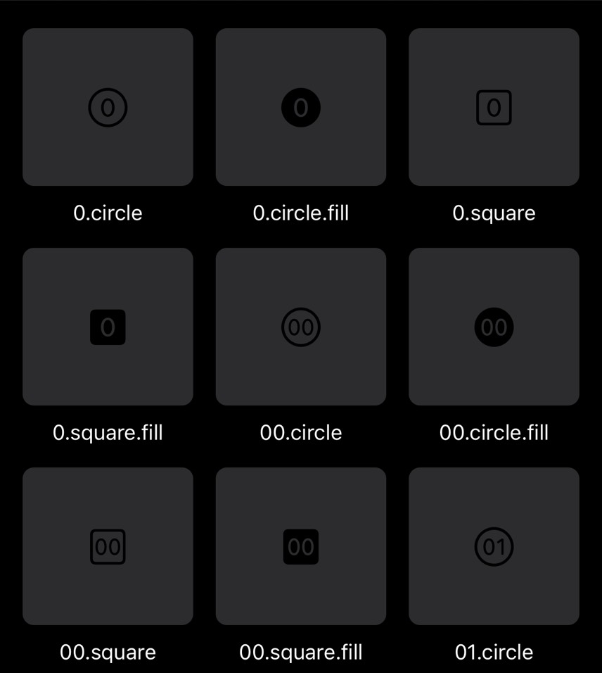
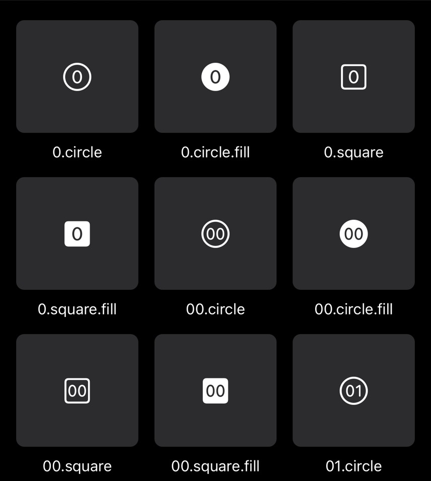
SF Symbols
Language
English only for version 1
Accessibility
Dynamic type, VoiceOver
Interface layout
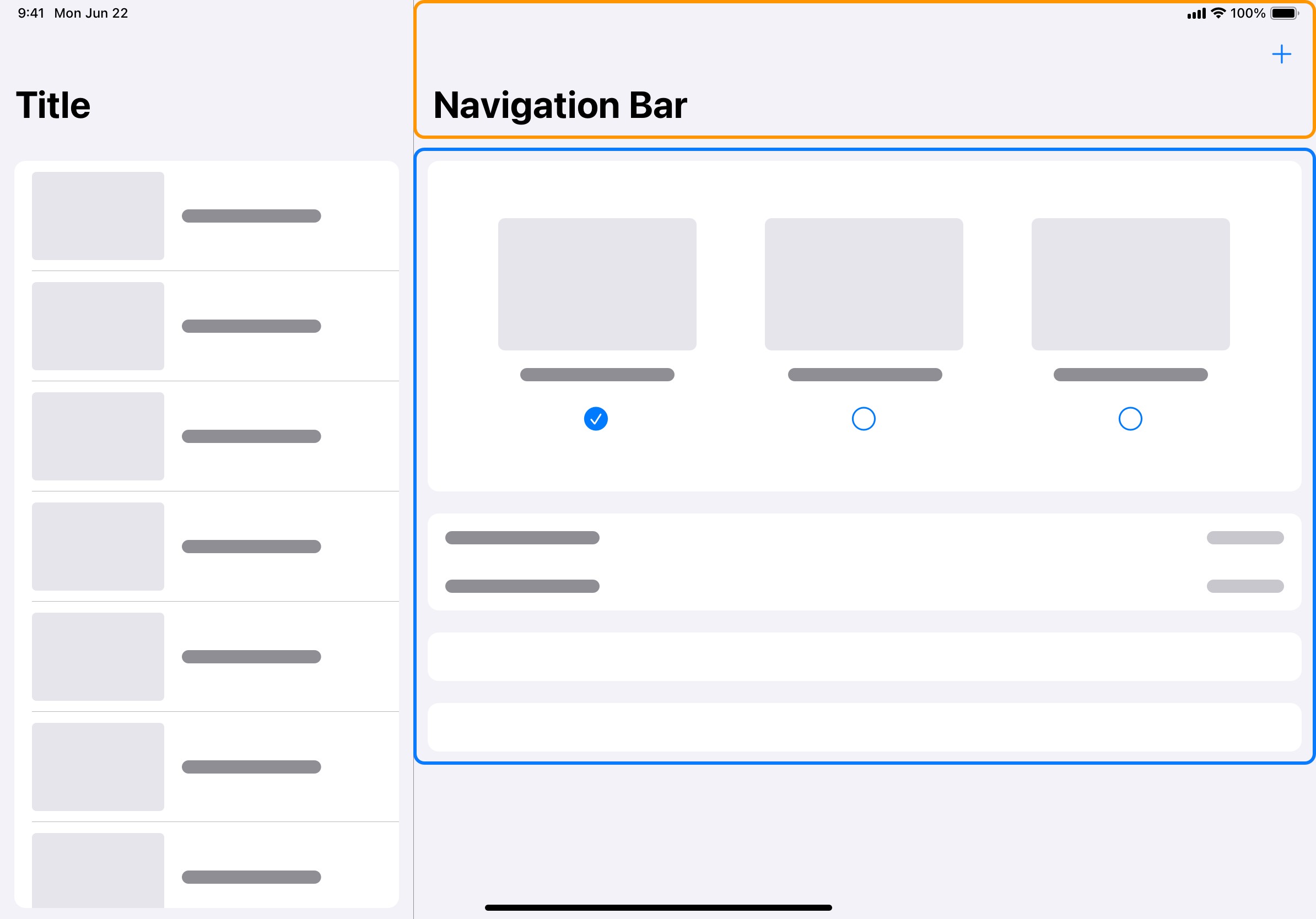
Since my app will be a designer tool/reference type of app, and each component will have its own child page, plus it needs to run on iPhone and iPad, I decided to use split view as the foundation of my interface layout because it is commonly seen UI pattern in Reference/Utility apps and it is very versatile.
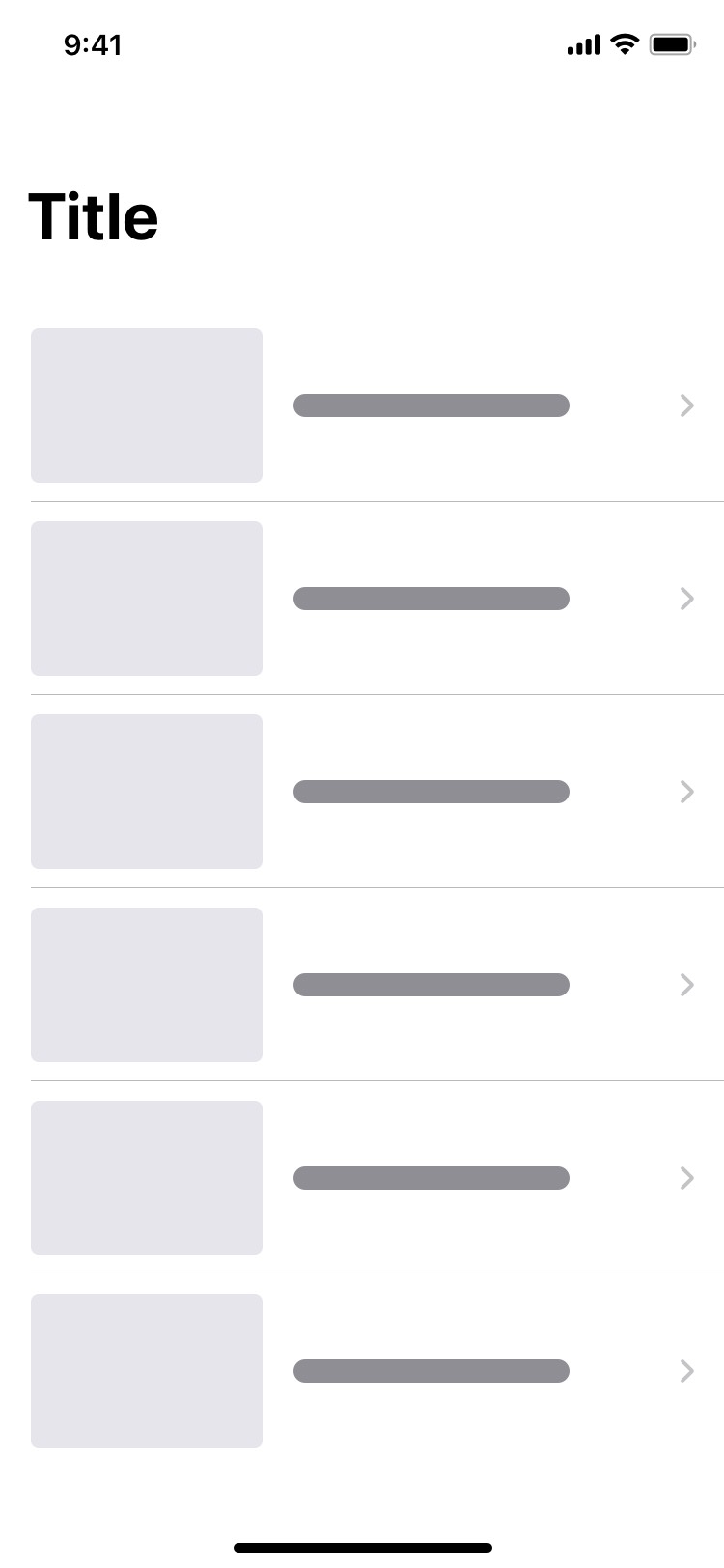
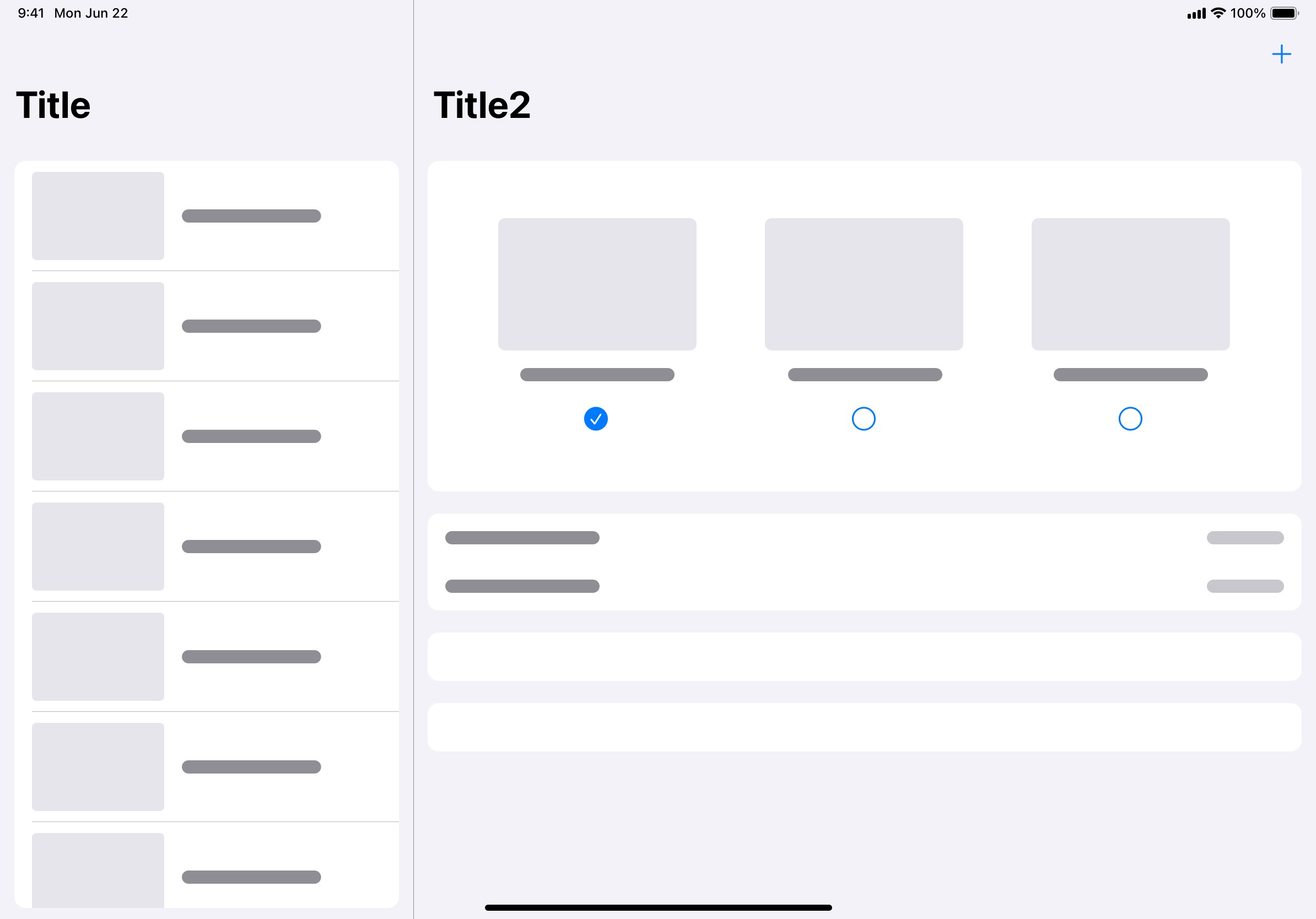
With compact screen space, the homepage can be a list of entries to child pages. While on iPad, with more screen space, the detail portion of the split view can be a good place for configuration options alongside the entries on the master portion.
Design
Configuration page
Each UI component will have its own child page. I call it the configuration page because this is where the user can preview the UI component and customize it with provided configuration options. These configuration pages will be the most essential piece of my app.
A configuration page's UI can be divided into two sections. The first section is a usually demo of that UI component. The second section is a collection of configuration options that are available for users to customize. The result should be reflected in the demo section accordingly.


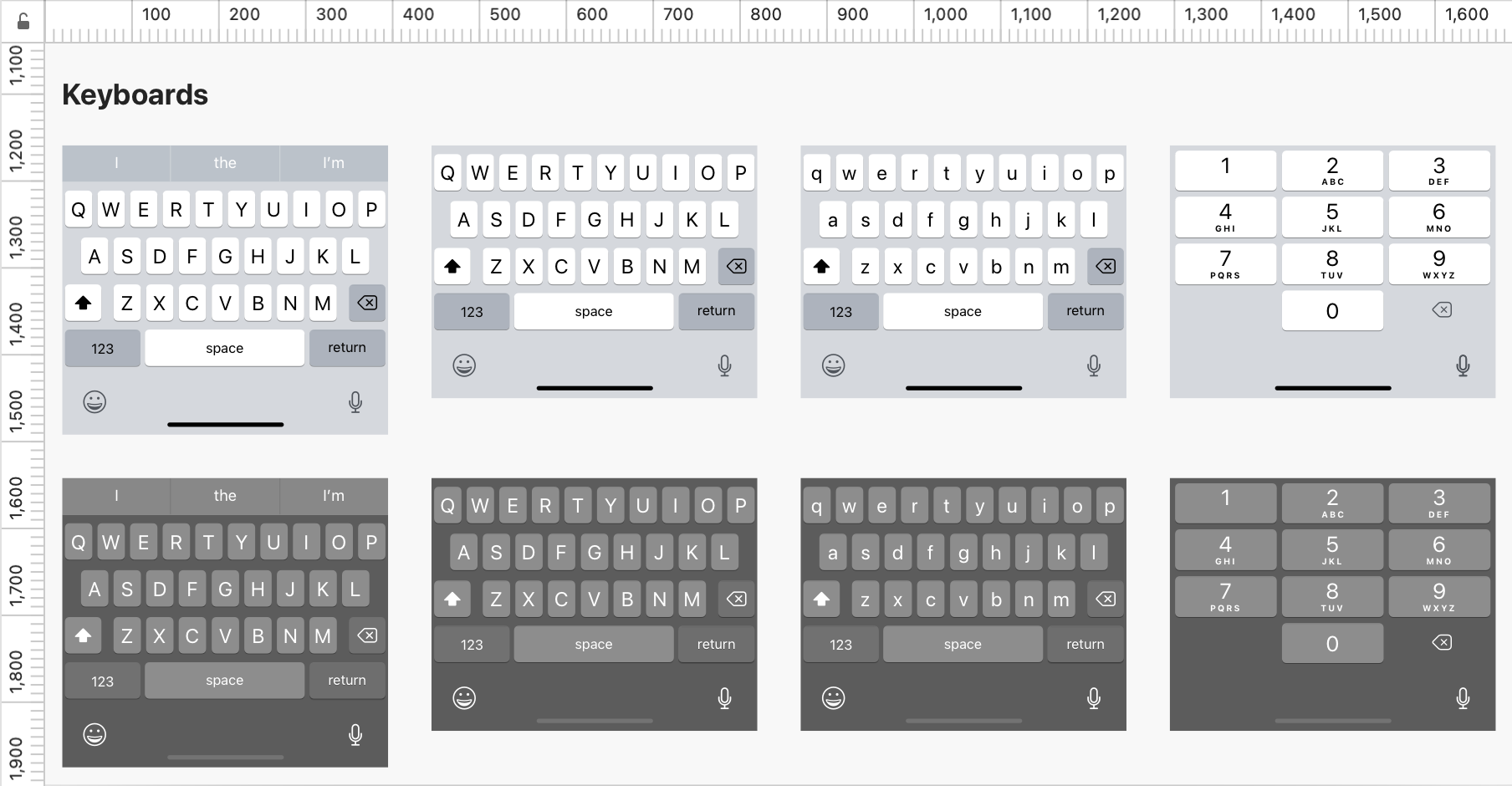
Component thumbnail
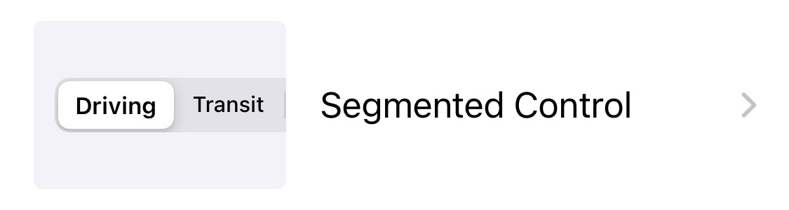
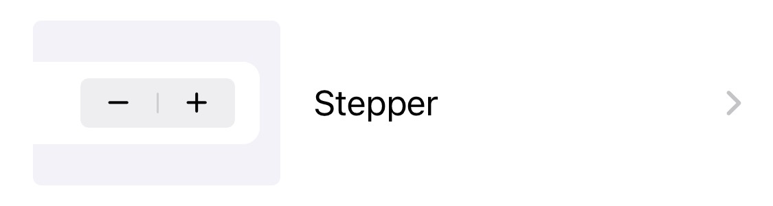
Upon opening app, users will see a list of components, each of which is an entry to the child configuration page. However, to help users who are not so familiar with iOS UI components identify what "Segmented Control" looks like, a text label alone just won't cut it. Users will need something else to help them identify a component.
Use a symbol to represent each component! Sounds easy, right? Not really. Some components don't really have a proper native SF Symbol to represent that. I could customize one, but I was concerned that I couldn't create ones that can represent certain components like Segmented Control and Action Sheet properly. The idea is to help even users who are not so familiar with iOS UI components identify what "Segmented Control" means.
Therefore, I decided to go with the idea of creating thoughtfully designed thumbnail for each component by including more details that capture the essential traits of a component.
High-fidelity mockups


Build it in Swift!
Usually after the high-fidelity design is ready at my work, I move on to usability testing with a high-fidelity prototype before the actual production begins. This time, when I finished the first version of high-fidelity design, I already learned Swift for almost one year and I became a master of Swift. Without constraints of any release timeline, I decided to build the prototype in Swift first then performed usability testing with it.

Usability testing
General feedback
As of now the first usability testing session has been conducted among five testers. All the testers are required to be UX/UI designers who work with iOS design patterns at different levels. The testers' feedback was generally very positive. Here are some of highlights:


Defects & areas of improvement
There are several defects/areas of improvement found during the usability testing. Three major ones are listed below:

The first round of usability testing was very helpful. I truly appreciated the testers who gave me those valuable feedback and helpful suggestion. I plan to have at least one testing session for every future version that involves UX/UI changes.
Branding
When it comes to my app's branding, I just want to keep it clear and to-the-point. When my users see my app, they can immediately understand what it can do. That is what I'm aiming to achieve with my branding.
App Name
Obviously my app is all about iOS UI components and the ability to experiment on different UI components right from the app. Therefore I would like to incorporate "UI component" and something like "lab" into the app's name, but that would make the name a bit verbose, so I replaced "UI component" with "UI kit" and there you go. I decided to name my app:
UIKit Lab
Experimenting on base app icon
Another important part of branding is designing an app icon that best represents UIKit Lab. In the initial drafts, I tried to base my icon design on some kind of abstract graphical representation of "UI kit". I experimented on a bunch of candidates and these were the 3 most promising ones:


I finally chose this "cube" concept to represent the basic building-block of UI.
Tuning the right tone
I want the cube to appear closer to a real 3D object, so I added color gradient to the surface to strengthen the visual resemblance of light casting on the cube. The main color scheme used in UIKit Lab is blue, pure white, and light gray. Therefore I tried to find a balance between them and use it as the base of the color gradients. For the background, I chose a simple white background to create the minimal visual appearance.


I think the final icon achieves a balanced blend of colors used in UIKit Lab and it creates a tranquil and elegant visual appearance.

Marketing
Social media promotion

Release UIKit Lab on App Store


What I learned (as of version 1.0)
It is one thing to design UX and UI in an app using standard iOS UI components, it is another to design UX and UI in an app that allows lightweight customization to those iOS UI components. At the end of the day, I'm designing and building a tool for my fellow designers, so the attention to detail, pixel-perfect design, and intuitive interaction become even more necessary (and definitely more challenging). There are still areas to improve and I will try to get more feedback from the real world and keep enhancing the experience of UIKit Lab in the future versions!


